Understanding Colour

Colour is the most relative of the formal elements of art. That is to say that how a colour appears will be deeply affected by the colours around it. Understanding this is central to learning how best to use colour. For instance, whilst a bright red may appear to be striking, it will appear less so against a yellow than against a blue background. This is because some colours compliment one another whilst some colours clash with one another.
Complimentary and Clashing Colours
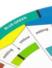
There are seven colours in the ‘colour wheel’ or ‘colour spectrum’ visible to the human eye. The colour wheel was devised by Isaac Newton to show how these colours best interacted with each other. You can draw a colour wheel using any coloured medium (colour pencils, crayons, pastels or paint) by drawing a circle and subdividing it in to 6 parts (here indigo and violet are taken as one colour – purple).Now, starting clockwise from one division of the circle, move around the wheel filling each division of the circle with the following colours in order: Red, Orange, Yellow, Green, Blue, Purple (Indigo/Violet). These colours can be remembered in order using the following rhyme: Richard Of York Gave Battle In Vain (with each letter of the first word representing the colours from Red to Violet in the seven colour system).
There are several things that one can discover about colour using the colour wheel: For example, starting from Red you will see that primary colours two spaces apart have their secondary colour between them (the colour you will get if you mix two colours together), in this case ‘Orange’ between Red and Yellow.
You will also be able to see that colours that are often said to clash, such as Green and Red are directly opposite each other. The same can be said of Blue and Purple, Yellow and Orange. If you were to mix any two of these opposing colours you would get a grey-brown.
Whether these opposing colours can be said to compliment one another or clash depends on the context they are in: Red and Green, for example, are so tonally close that they sometimes compliment one another, yet sometimes, because they are opposing colours, they clash, especially as Red is a ‘hot’ colour that jumps forward, whilst green (a cold colour) recedes.
You will also note that colours two steps apart go well together, whilst those just one step away from each other bear the closest similarity overall. In the latter case this similarity may lead them to compliment one another, but it can also detract from their respective strengths. This can be seen with Red and Orange: Orange seems far less bold placed next to red than it does if it appears on a white background alone – or next to a blue!
The most important thing to remember here is that all colour will impact on all other colour. The only way to maintain the resonance and power of one colour is to create a vast monochromatic plane of that colour, as with Yves Klein’s (1928-1962) purely ‘Blue’ paintings, and the work of other ‘Colour Field’ painters.
If you are not a monochromatic painter, you will need to have sensitivity to the relative aspect of colour. You can get a feel for differing colour combinations purely by experimenting with how differing sheets of paper affect one another. You can then apply your discovery to your painting.

Re: Contextualising Your Work
Dear Mr Watson, I have been working relentlessly for 40 years through Art, writing, performance based expressions in theatre, dance,…
Re: How to Sell My Paintings and Drawings?
Hi , I would like say about my cousin that he live in Afghanistan and he is fabulous in art painting and doing job…
Re: How to Sell My Paintings and Drawings?
Amy - Your Question:Hi I have just left school and I love to draw I do pencil work and I would love to sell my…
Re: How to Sell My Paintings and Drawings?
Hi I have just left school and I love to draw I do pencil work and I would love to sell my drawing but I don't no how…
Re: How to Sell My Paintings and Drawings?
Hi, I have 3 drawings the information as follows: 1- Salvador Dali (Spanish Draftsman). Is 24x19 cm. 2- Pablo…
Re: Freeing Yourself Up
I love drawing so much and I will like to be one of the best artist in the world
Re: How to Sell My Paintings and Drawings?
anna-81 - Your Question:Hi, I need help how can I sale my paintings and drawings and I want to know if my work is…
Re: How to Sell My Paintings and Drawings?
Hi, i need help how can i sale my paintings and drawings and i want to know if my work is really good or not. I'm…
Re: How to Sell My Paintings and Drawings?
i want to sell my drawing give me the idea.
Re: How to Sell My Paintings and Drawings?
I am 15 years old and i would like to sell my pencil drawing