Tone

Tone is one of the four fundamental pillars of drawing and painting. Tone refers to the level of lightness and darkness in a drawing or painting, and as an element, contributes strongly to the level of dramaticism in an artwork.
The Latin term 'chiaroscuro' refers to the contrast between light and dark and is often used to refer to stark differences held within an artwork. Such strong clashes between light and dark can be seen in the works of Titian (1485-1576), Velazquez (1599-1660), Rembrandt (1606-1669), Vermeer (1632-1675), Auerbach (b.1931) and Kiefer (b.1945).
Artists who employ such heavy clashes between tones tend not to rely heavily on the use of colour, preferring to limit their pallet to browns, yellow ochres, blacks, greys, creams and whites (with occasional areas of colour for effect). However, tone is of vital importance to artists that rely heavily on colour, as each colour carries with it a tone, and how tones exist side by side will effect how the artwork is perceived by the viewer.
Tonal Artworks
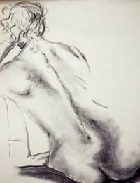
Tone is such a strong element in drawing and painting, which whilst artists employing mainly line or colour must pay heed to tone, it is possible for an artwork to be comprised entirely tonally with no regard whatsoever for line, colour or impasto. This can be seen readily in the early charcoal portrait drawings of Frank Auerbach, which are comprised of tonal differences produced by varying thicknesses of charcoal against plain paper. The richness of these works exists for the contrast between light and dark.Strong contrasts can also be seen in abstract artworks, lending a crispness as well as a dramaticism. Barnett Newmann (1905-1970), for example, attempted to convey the story of the crucifixion of Christ through simple black lines painted upon white canvases.
Tonal Exercises
The importance of tone can be easily demonstrated without the need to get bogged down with the specifics of drawing and painting by simply producing a collage self portrait using just black, white and grey pieces of paper. Make the portrait from an image of your face in a mirror in a half lit room with the light on one side of your face. Using extreme tones in this way will help to convey the importance of light and dark.Another simple exercise involves the use of a scanner and printer or a black and white photocopier. Using these materials simply take a picture from a magazine with a lot of colour, photocopy or scan it and print it in black and white. Doing this will help you to understand the tonal relationship present in any image, however colourful it is.
If you do this several times you will be able to ascertain the difference in tone of certain common colours. For example, red, green and brown are always dark in tone, whilst yellow and pink are relatively light tones. Once you have done this you can try composing pictures tonally, with colour in them. Though remember that colour is the most relative of all aspects of the artwork and what colours you use side by side will have a huge effect on the artwork!

Re: Contextualising Your Work
Dear Mr Watson, I have been working relentlessly for 40 years through Art, writing, performance based expressions in theatre, dance,…
Re: How to Sell My Paintings and Drawings?
Hi , I would like say about my cousin that he live in Afghanistan and he is fabulous in art painting and doing job…
Re: How to Sell My Paintings and Drawings?
Amy - Your Question:Hi I have just left school and I love to draw I do pencil work and I would love to sell my…
Re: How to Sell My Paintings and Drawings?
Hi I have just left school and I love to draw I do pencil work and I would love to sell my drawing but I don't no how…
Re: How to Sell My Paintings and Drawings?
Hi, I have 3 drawings the information as follows: 1- Salvador Dali (Spanish Draftsman). Is 24x19 cm. 2- Pablo…
Re: Freeing Yourself Up
I love drawing so much and I will like to be one of the best artist in the world
Re: How to Sell My Paintings and Drawings?
anna-81 - Your Question:Hi, I need help how can I sale my paintings and drawings and I want to know if my work is…
Re: How to Sell My Paintings and Drawings?
Hi, i need help how can i sale my paintings and drawings and i want to know if my work is really good or not. I'm…
Re: How to Sell My Paintings and Drawings?
i want to sell my drawing give me the idea.
Re: How to Sell My Paintings and Drawings?
I am 15 years old and i would like to sell my pencil drawing