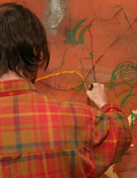
Hot and Cold Colours

Colours are often perceived as having associations that are not immediately linked to their actual material existence. For example green is associated with nature and foliage, even though the green you see might be a ‘green sports car’, something that we have learned can be directly damaging to the environment.
For some people other colours evoke moods (such as light blue, which evokes calm, and orange which causes agitation), whilst for others colour can even evoke musicality, or smells. The way in which these visual impressions can merge with other sensory perceptions is very subjective, and is felt very strongly by some people, and hardly at all by others.
The association of certain colours with heat and others with cold, however, is universal (barring some people that experience colour blindness). Reds, oranges and yellows tend to be classed as ‘hot’ or ‘warm’ colours, whereas greens and blues tend to be considered to be ‘cold’ or ‘cool’. White and black can both be considered either hot or cold, depending on the image they are contained within (for example, white can symbolise snow, or extreme ‘white heat’).
The Science Behind Hot and Cold Colours
Whether a colour appears hot or cold does not only indicate how we associate that colour in terms of the perceived temperature of the scene depicted in a painting or coloured drawing. It also affects how we perceive distance, as warm colours always ‘come forward’ in a painting, whilst cooler colours ‘recede’.This can be seen in any accomplished landscape, where the background will gradually be painted bluer, the further and further back that the image is depicted. It must also be added, that as colours are relative to each other, not only must one remember that the bluest colours recede, and the reddest come forward (in our perception), but that any colour next to a vibrant red (red being the colour that comes forward the most) will tend to appear to stand behind that red, and so on. This means that if you wish to depict a blue figure in front of a redder colour, you may wish to play significantly with scale to evoke this effect. Alternatively, you apply a thin red glaze (see related article on glazes) to the blue to bring it forward.


Re: Contextualising Your Work
Dear Mr Watson, I have been working relentlessly for 40 years through Art, writing, performance based expressions in theatre, dance,…
Re: How to Sell My Paintings and Drawings?
Hi , I would like say about my cousin that he live in Afghanistan and he is fabulous in art painting and doing job…
Re: How to Sell My Paintings and Drawings?
Amy - Your Question:Hi I have just left school and I love to draw I do pencil work and I would love to sell my…
Re: How to Sell My Paintings and Drawings?
Hi I have just left school and I love to draw I do pencil work and I would love to sell my drawing but I don't no how…
Re: How to Sell My Paintings and Drawings?
Hi, I have 3 drawings the information as follows: 1- Salvador Dali (Spanish Draftsman). Is 24x19 cm. 2- Pablo…
Re: Freeing Yourself Up
I love drawing so much and I will like to be one of the best artist in the world
Re: How to Sell My Paintings and Drawings?
anna-81 - Your Question:Hi, I need help how can I sale my paintings and drawings and I want to know if my work is…
Re: How to Sell My Paintings and Drawings?
Hi, i need help how can i sale my paintings and drawings and i want to know if my work is really good or not. I'm…
Re: How to Sell My Paintings and Drawings?
i want to sell my drawing give me the idea.
Re: How to Sell My Paintings and Drawings?
I am 15 years old and i would like to sell my pencil drawing