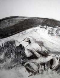
Working with Tone

Tone is a fundamental aspect of drawing and painting that will impact heavily on the way that a finished work is received.
Generally, dark tones are used to evoke heavy, menacing scenes, whilst light tones are used to evoke peace and tranquillity. Mid tones, on the other hand, tend to suggest the warmth of nature (as in browns and greens) passion (as in reds), and the metropolis/technology (greys).
Extremes of tone are used to convey high drama, or a sense of regality and power, as with the works of Velazquez (1599-1660) and Rembrandt (1606-1669).
Tone has been central to the development of painting, from its beginnings to the Modernist period, when abstract artists such as Malevich (1878-1935), Mondrian (1872-1944) and, later, Newman (1905-1970) all explored the simplicity of black and white geometric forms.
However you wish to work, tonal variation will be of vital importance and is an aspect of drawing and painting that will shine through even if you wish to focus primarily on line drawings or on colour. In other words, tone remains of prime importance even when you intend upon focusing on one of the other pillars of artistic development.
Tonal Exercises
For a first exercise try an ‘appropriation’ of a well known artwork. An appropriation (sometimes called a ‘transcription’) is an artwork made not as a copy of a well known piece, but as a piece based on an existing famous artwork.By talking an example of a colourful famous work and either making a black and white photocopy, or a good scan and black and white print of it, it is possible to see how that colour painting is actually comprised partly of varying tones. By then making a black and white painting from the black and white print, you will be able to gain a better understanding of the centrality of tone to painting, and the relationship that painting has to tone. You may note, for example, that red and green are very dark tones, whilst yellows and pinks are much lighter. You will also notice that some colours are very close tonally, whilst other s contrast tonally.
For the next exercise simply use a glue stick and any black and white paper: magazines, scrap paper, newspapers etc.
Cutting the paper into small pieces, next make a portrait collage based your image in a mirror, in a half lit room, using just the extremes of black and white to evoke the features of their face.
The result will be a dramatic image, that you can then produce a simple painting from (basing this painting on the collage image). In doing so you will be able to see how tone is the basis of all images, and how that reducing images to pure tone tends to increase dramatic effect.
For a third exercise, draw again your own mirror image in a half lit room, covering one sheet of A2 paper entirely in charcoal, before drawing into it using a standard eraser. Doing this will show to you the extent to which painting and drawing can be composed purely of tone – dark tones being drawn upon white tones, and vice-versa.


Re: Contextualising Your Work
Dear Mr Watson, I have been working relentlessly for 40 years through Art, writing, performance based expressions in theatre, dance,…
Re: How to Sell My Paintings and Drawings?
Hi , I would like say about my cousin that he live in Afghanistan and he is fabulous in art painting and doing job…
Re: How to Sell My Paintings and Drawings?
Amy - Your Question:Hi I have just left school and I love to draw I do pencil work and I would love to sell my…
Re: How to Sell My Paintings and Drawings?
Hi I have just left school and I love to draw I do pencil work and I would love to sell my drawing but I don't no how…
Re: How to Sell My Paintings and Drawings?
Hi, I have 3 drawings the information as follows: 1- Salvador Dali (Spanish Draftsman). Is 24x19 cm. 2- Pablo…
Re: Freeing Yourself Up
I love drawing so much and I will like to be one of the best artist in the world
Re: How to Sell My Paintings and Drawings?
anna-81 - Your Question:Hi, I need help how can I sale my paintings and drawings and I want to know if my work is…
Re: How to Sell My Paintings and Drawings?
Hi, i need help how can i sale my paintings and drawings and i want to know if my work is really good or not. I'm…
Re: How to Sell My Paintings and Drawings?
i want to sell my drawing give me the idea.
Re: How to Sell My Paintings and Drawings?
I am 15 years old and i would like to sell my pencil drawing